
-
Shopify Plus
+2
PrestaShop Migration
PrestaShop to Shopify Migration in 2026: Real Cost, Timeline, and What Actually Breaks
Functional designs:

In recent months, we’ve talked a lot about unified commerce, emphasizing the need for seamless integration across all sales channels—online and offline—to create a fluid customer experience. But what about design? In an era where brand identity needs to be consistent and compelling across every touchpoint, the idea of “unified design” emerges as equally crucial. It’s not just about making things look cohesive; it’s about ensuring that every element of a brand’s digital presence amplifies its identity and drives conversions, all while maintaining the same experience across other platforms.
But how do you strike that perfect balance between looking good and performing even better? Let’s dive into some real-world examples where creativity meets functionality, and where brand identity is not just maintained, but enhanced. These brands have mastered the art of blending form with function, creating digital experiences that are as compelling as they are effective.
Boldking’s website is a prime example of how a well-executed design can seamlessly blend brand identity with user experience. Their slogan, “The Flexible Brand,” is a guiding principle that is evident throughout their website. Every detail is designed to not only look good but also guide users smoothly through their shopping journey.
What sets Boldking apart is how they blend vibrant, modern design with a user experience that feels effortless. The navigation is straightforward, leading users from browsing to buying without any friction. Whether you’re picking up a single razor or subscribing to their service, the whole process is clear and user-friendly—just the way it should be.
And then there are the little touches—like the subtle animation when you click a button—that add a bit of personality without shouting for attention. Click on the logo, and their slogan appears, gently reminding you of their core value: flexibility. Subscription options are right where you need them, too, with the “BoldkingRepeat” section making it easy to dive straight into a recurring purchase.
The product pages keep that same visual harmony, with background colors that match the product and small details, like rating stars, that build credibility without disrupting the brand’s flow. Whether deciding between a one-time purchase or a subscription, the process is as straightforward as it gets.

See the website here.
Design: Analogue Agency
Development: Ask Phill
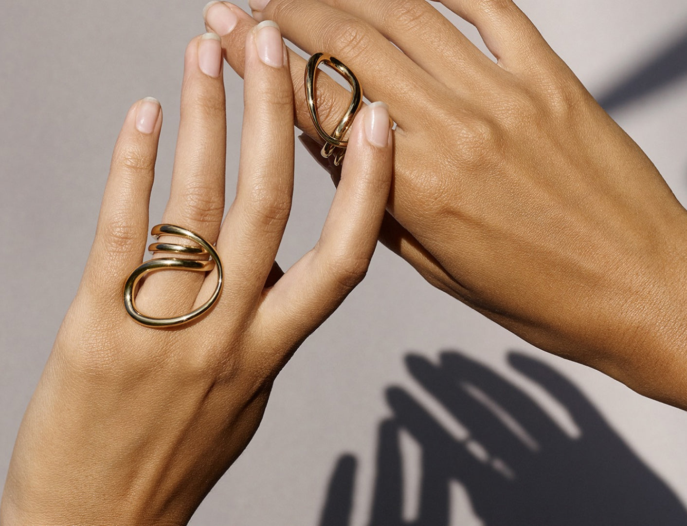
Charlotte Chesnais isn’t just any jewelry brand; it’s a showcase of wearable art. Her website is a reflection of this philosophy, blending bold, poetic design with a user experience that feels as unique as the pieces themselves. The essence of “sculpture in motion” is palpable throughout the site.
The most striking feature? The product pages, where each piece of jewelry takes center stage with a large, rotating 3D model. It’s an audacious design choice, but it’s not just for show. These pieces are intricate, with details that demand a closer look, and the 360-degree view gives customers the best possible way to appreciate the craftsmanship. The experience is immersive, almost as if you’re holding the piece in your hands.
Yet, despite this bold design, the user journey remains smooth and intuitive. All the essential product information is neatly arranged on the side, with a clear design hierarchy that guides users seamlessly through material choices and other details. The design balances minimalist elements with subtle animations, maintaining a sense of elegance and poetry that aligns perfectly with the brand’s identity.
Another notable touch is the brand’s logo, always present in the top left corner, subtly rotating as you navigate the site. It’s a small but impactful detail that keeps the brand’s artistic spirit alive on every page. Even the act of adding a piece to your cart is celebrated, with a playful animation of logos falling across the cart, adding a touch of joy to the shopping experience.
See website here.
Design: Denny Backhaus
Development: Ask Phill
Rains’ website stands out for its strong and consistent art direction, which plays a crucial role in maintaining the brand’s unique identity. As soon as you land on the homepage, you’re immersed in a design that feels both urban and sleek, perfectly mirroring the functional style of their products. The layout is clean, with bold, tech-inspired elements that create a cohesive and modern aesthetic. Subtle and well-placed motion effects make the site visually engaging while remaining intuitive and easy to navigate.
But what truly sets the Rains website apart is its ability to align the digital and physical brand experiences so perfectly. Across their retail stores, including the one on Rue Saint-Sulpice in Paris (see below), the minimalistic design, futuristic vibe, and consistent use of tones create a seamless transition from the digital space to the physical one. It’s as if you’ve stepped right into their online world. This unified design approach is invaluable, especially in an era where unified commerce is key. When a brand’s digital and physical environments are perfectly aligned, it reinforces the brand’s identity at every touchpoint, immersing customers fully in the brand’s universe and ensuring a cohesive, powerful experience wherever they engage.

See website here.
Design: Good city
Development: Grafikr

Oddity Fragrance takes an unconventional approach to the challenge of selling perfume online—how do you convey a scent through a screen? The answer lies in their ability to evoke emotions and moods using distinct imagery, moodboards, and even curated playlists, all tailored to each fragrance. The site is less intuitive and more niche compared to something like Rains, but that’s where its charm lies. It invites you to linger, to explore, and to connect with each perfume on a deeper, more personal level.

What’s particularly intriguing about Oddity Fragrance’s web design is how it turns the selection of a perfume into a poetic, almost luxurious experience. Every detail, from the whimsical visuals to the delicate motion design, tells a story—one that’s as complex and nuanced as the fragrances themselves. The site’s design isn’t just about aesthetics; it’s about creating a sensory journey that makes each product feel unique and special. In a world where choosing a perfume is a delicate decision, Oddity Fragrance ensures that you’re not just buying a product—you’re engaging with an experience that resonates with your emotions.
See website here.
Design: .Oddity Studio
Development: .Oddity Studio
Halo Dental is shaking up the dental industry with its first-of-its-kind digital mirror, designed to simplify dental practices. We’ve included Halo Dental in this list because it offers a fresh perspective on B2B ecommerce—an area that’s becoming increasingly important to treat with the same strategic attention as B2C. Their website, much like their product, is nothing short of innovative. The design team took a similar approach to Apple’s playbook, presenting their tech product with a sophisticated, scroll-driven narrative that feels almost cinematic.
The site is a masterclass in showcasing a highly technical product without losing the user in details. The 3D models and expansive product pages allow dental professionals to get up close and personal with the features and benefits. What’s particularly smart here is the dual-menu bar setup—one at the top for quick access to essentials like product info and pricing, and another that appears as you scroll, breaking down the product’s features in even more detail. It’s a clever way to cater to the different needs of B2B users who might be exploring the site for various reasons.

On mobile, where scroll animations can be a bit clunky, Halo Dental switches things up with a video presentation, ensuring that the experience remains smooth and engaging. The pricing page is another standout, guiding potential buyers through a three-step process that’s clear, straightforward, and packed with visuals that show exactly what they’re getting. The interactive scroll feature, which lets you see how the product integrates into a dental practice, is a brilliant touch—it makes the value of the product instantly tangible.
Even the FAQ section, which is critical for a technical, high-investment product, is seamlessly woven into the design. Halo Dental’s site is a prime example of how B2B ecommerce can—and should—offer an experience that’s just as polished and engaging as anything on the consumer side.
See website here.
As the lines between digital and physical continue to blur, the importance of a cohesive, well-executed ecommerce design cannot be overstated. These brands have shown that whether you’re engaging consumers with immersive storytelling or simplifying complex product details for professionals, the right design can elevate your brand and make a lasting impact. It’s not just about making a site that looks good—it’s about creating an environment where your brand’s values and your customer’s needs intersect, driving both engagement and sales.
At Ask Phill, we understand the power of combining design and development to create ecommerce experiences that captivate and convert. With our in-house creative services, we’re equipped to bring your brand’s vision to life—ensuring every digital touchpoint resonates with your audience while meeting your business objectives. Whether collaborating with external agencies or leading the design ourselves, we deliver results that resonate. Contact us to learn more.
PrestaShop Migration
PrestaShop to Shopify Migration in 2026: Real Cost, Timeline, and What Actually Breaks

Shopware migration playbook
Shopware to Shopify Migration in 2026: Real Cost, Timeline, and What Actually Breaks

Enterprise migration playbook
Salesforce Commerce Cloud to Shopify Migration in 2026: Real Cost, Timeline, and What Actually Breaks